“Old Masters 02”, Meddled With
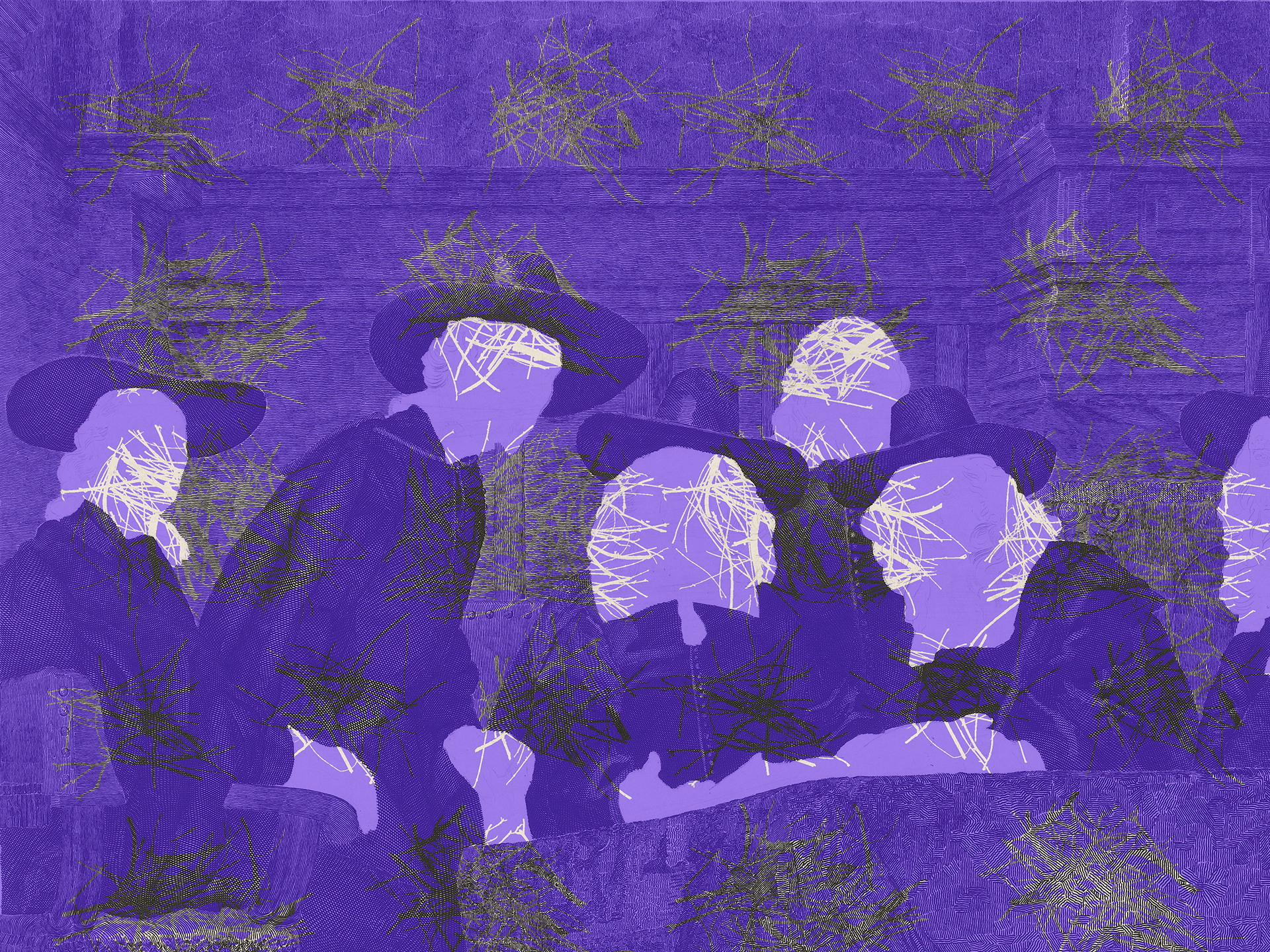
"Old Masters 02", Meddled With After showing you how expressive layered faces can be, this time faces are otherwise meddled with for disguise. I should …
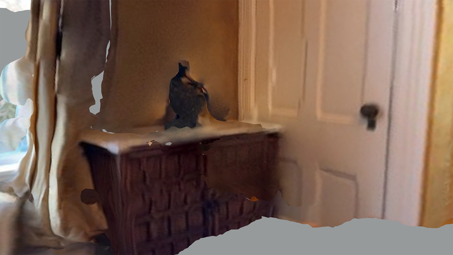
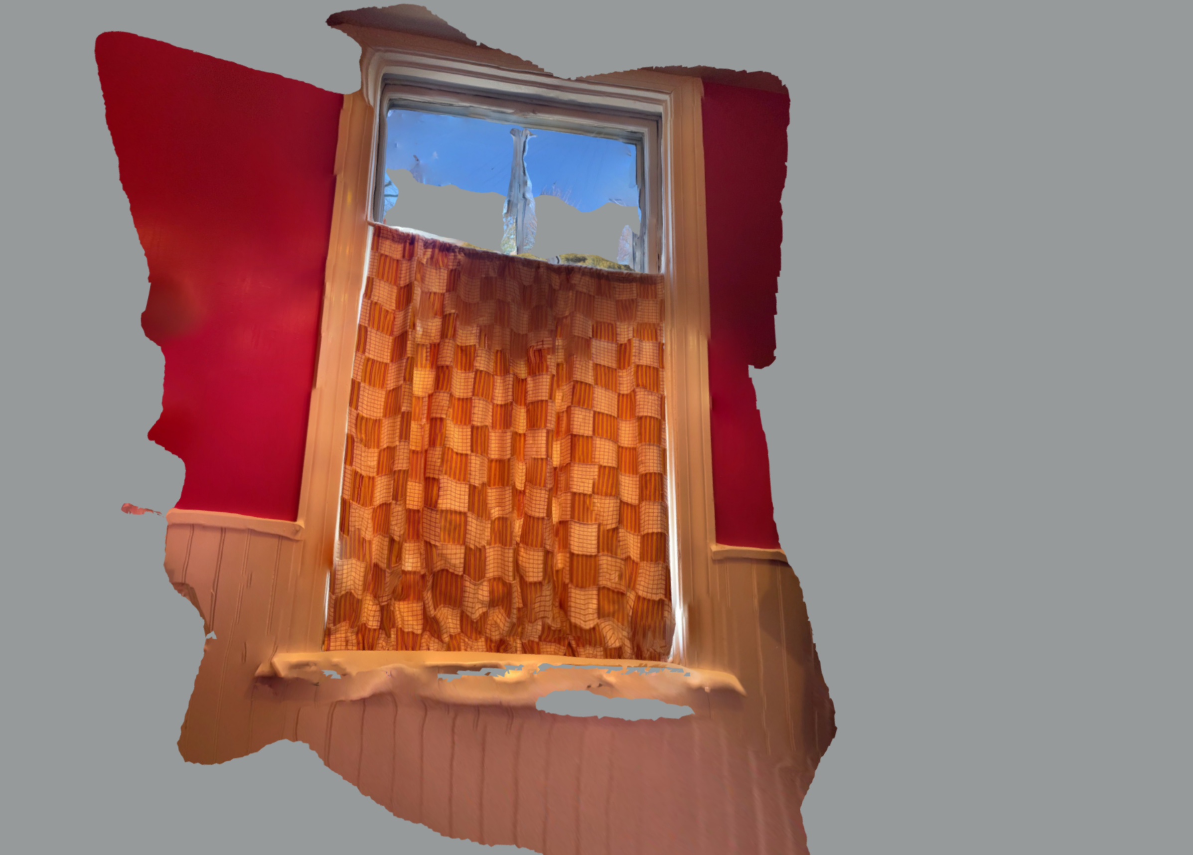
Learning to Be a LiDARer Undoubtedly there is a cartoonish — or more politely said painterly — effect to LiDAR scans. Not …
LiDAR Lights Up My Life I’m full of juice! Don’t know if this is how other artists experience it but I’ve …
Calligraphy in Motion, a Follow-up A few days ago I wrote a post about Rus Khasanov whose videoed ABCs make you rethink what …
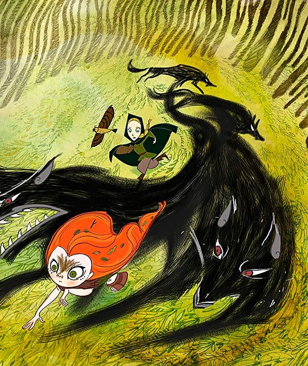
Cartoon Saloon Savvy Article by Mark O’Connell New Yorker, Story Time, Dec 21, 2020, p. 26 fl When the director of Pixar’s …
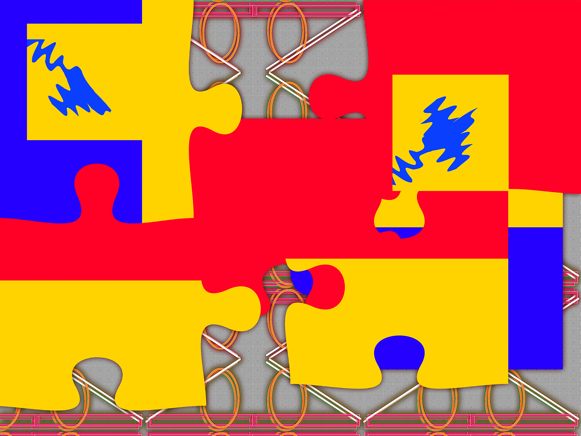
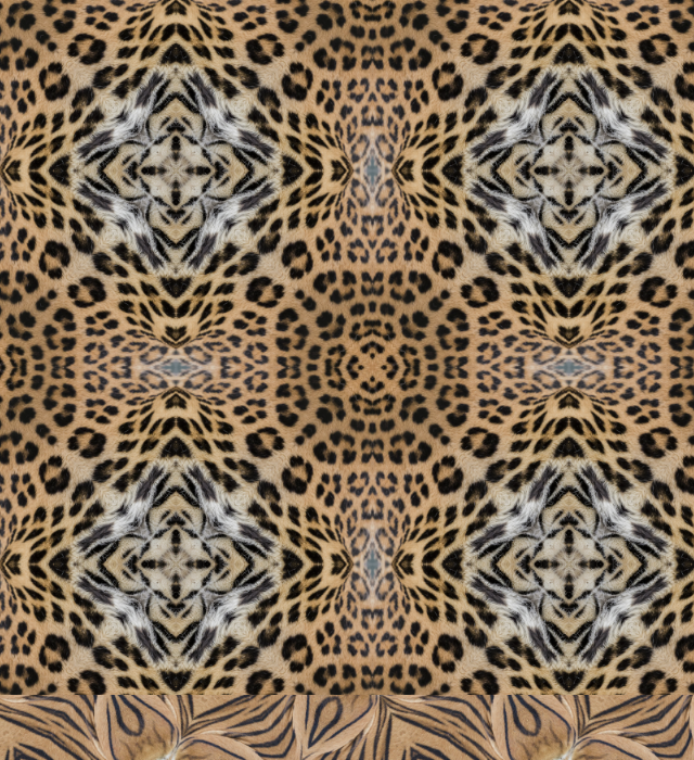
A. Two patterns in one frame. B. Pattern unit compiled from A, tiled out into a pattern. C. Same as B but with alpha (blank …
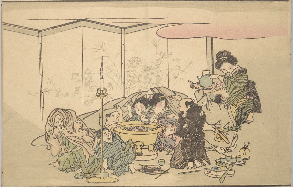
“Adults and children huddle around a brazier, or coal fire, to hear ghost stories.” “A man, perhaps the …
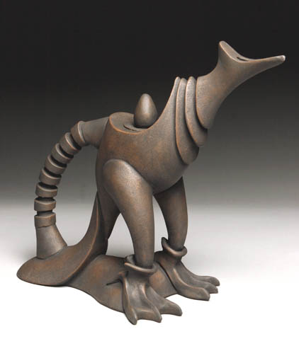
Once you see the ceramic hybrids of Gerard Ferrari, they may wander in the back of your mind for weeks. He promiscuously combines beastie …
CG Textures, an endless compendium of images, is just now processing a new batch of animal and bird photographs. Glorious! If you don’t already have …
In this launch of the Green as Sky blog I welcome you to all I find fascinating — and hope that you’ll find delight here …