

Details of Wholes
When an artist mixes this with that, apples with oranges, copper and cork my interest perks up. In my ideal world I would have a studio assistant who was an ace with 3D programs. They would create the 3D images I ask for in the places within the 2D picture space and I’d fill in with artwork, photographs, patterns in what remained empty. I’d love that.
However here in the real world no one has volunteered to work for free and therefor I can’t hire them. But I can pay attention to ways in which other artists are mixing whatever they choose to mix. I’m also testing whether grabbing details from copyrighted works is acceptable fair use if I fully credit the artist whose detail I extract.
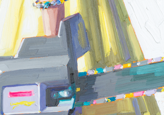
Kelly Reemtsen makes a mix that maybe no one else in the universe has chosen. Girls and women in 1960s summer dresses who are each holding or choosing among on a wall large weapons. Long axe, big gun, and here above a chainsaw. The vertcal female, the horizontal weapon, arrayed in a cross. (Important to note that the cross inference is purely mine, not reliably the artist’s.)
The detail which I find wonderful is that the colored beads in her bracelet are echoed in the biting edge of the chainsaw. Not realism but delicious, giddy. To allow herself to freelance that eloquent touch.
All Reemtsen’s females are faceless, usually without shoulders even, rarely feet. What we mostly see is from inches above the waist to partway down the leg — showcasing just where the telltale hem falls. And added to the mix are patterns on dresses and backgrounds, polka dots, florals, stripes, which interact in busy confusion. That’s a wild stew of characteristics. How likely this artist is not a woman?
____________
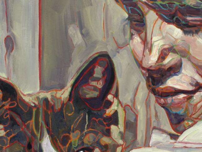
I’ve recently discovered Hung Liu’s paintings of people and shacks. Some I love, some I don’t. What stopped me in Homeless Cat and Boy is the contrast in styles from one part of the rendition to another. The boy’s nose and mouth are fairly conventional, readable. But the shady space where his eyes and the top half of the cat’s face are in a mishmash of colored lines resembling no known animal tissue. I find it beautiful, mesmerizing. I love the disjunct between realism and crazy abandon. I wonder why he chose just these parts. Because the choice is worth explaining. Discovering.
Here are a this and that worth taking further. To me they’re stronger than some of his more elaborate gambits. He has a convincing way with children and animals.
____________
I’m open to any flavor of this and that, materials, subjects, styles, scales. In terms of there being a posited language and grammar of combining visual images the use of contrasts is a message hard to ignore.