
Color, Deep

Of all the delicious things in the world — chocolate chip cookies with pecans, vegetable tempura, green peas and butter — there’s nothing I love more than color. OK, OK, mixing metaphors, but I find a combination of red and magenta both filling and nutritious. A flock of golden daffodils. The early yellow-green of deciduous — I feel I can inhale great whuffs of it. With color I’m a synesthesiac, every sense I taste with I color with as a verb.
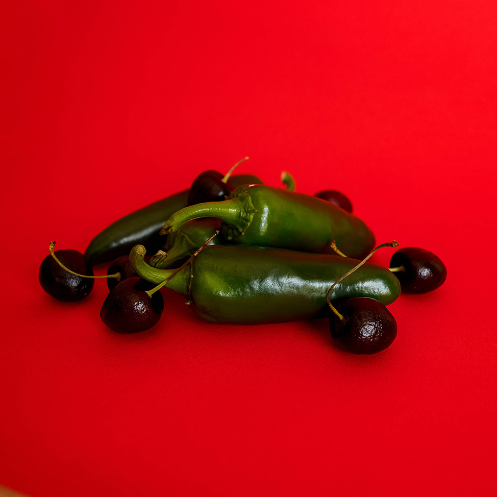
The Florida photographer Jude Infantini, Artist & Emu Connoisseur, has some color studies I keep thinking about. In particular the image above, the mix of fruit and vegetable so drenched in black that they’re practically unreadable — and yet the pleasure is in discovering that this display consists of colors opposite on the color wheel — red and green. Supreme color opposites. Actually the pairing I think most about. But here the artist has made so much of darkness he distracts you from the hues. Red and green with so much pitch black that you marvel at their sameness. Not contrast, not your normal peppy jalapino and cherry. Darkness.
Long ago I read that Renaissance masters used gray to stand in for many other colors. Now I understand.
_____
esprit de l’escalier It occurs to me that among Infanitini’s ploys is to site his arrangement on screaming red. This makes the contrast between intense saturation and an extreme of dark to light. Or not about red versus green but between color and shades of no color at all. I never went to art school so forgive me some naivety at times.
_____
Jude is found on unsplash.com, my newest favorite public domain image source.
Jude’s page is here.