

Scientific American 313, 32 – 39 (2015)
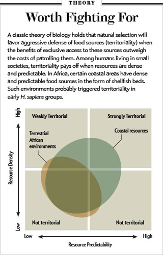
This infographic in Scientific American gnawed at me until I went back to study it. I ask you to look too. It’s divided into four equal parts in which a circle is centered and an oval superimposed on that. Why four parts instead of three? The information is separated into Not Territorial, Coastal Resources, Terrestrial African Environments. Why select a quartered circle to plot these against?
If a scientist used “ain’t” in a report it would leap off the page at you. But ill-conceived graphics? We don’t have enough fluency with them yet. Maybe infographic artists don’t either.
Giotto painted angels who looked like humans with halos and wings. Were they real? They’re real enough for Giotto’s purpose and for his audience lining the pews.
An infographic accompanies scientific data. It is ethically obliged to present that data clearly. Representing three categories as four obfuscates reality.

_______________________________
You may also enjoy my Pinterest board Fads in Depicting the Unseeable.