Gizelda Rosas
Featured Artists Gizelda Rosas Gizelda Rosas, La Batalla de Vortex, 2024. Acrylic, watercolor, natural pigments, appliqué, and embroidery on paper 42 x 72 in. Luis …
Ida Ekblad Paints, Sculpts, Glories in Artmaking To delight in Ida Ekblad‘s exhibit Blood Optics (directly above and below) is to …
Blinders on Critics In yesterday’s post I had one reaction to a Washington Post readers’ squabble over the merits of …
Clem Onojeghuo’s Photographic Eye The photography editors at the Washington Post have recently profiled Mark Ruwedel‘s Seventy-Two and One Half Miles …
Gallery of Eastern Europe Challenging Western Europe While looking at art by Edith Torony I came upon a gallery committed to the work …
Edith Torony, Painter of Enough Spaces to Interest a Physicist Saatchi Art recently focused on a group of paintings they found …
Calligraphy in Motion, a Follow-up A few days ago I wrote a post about Rus Khasanov whose videoed ABCs make you rethink what …
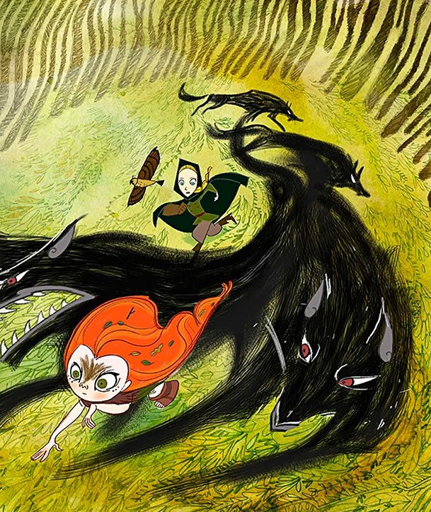
Cartoon Saloon Savvy Article by Mark O’Connell New Yorker, Story Time, Dec 21, 2020, p. 26 fl When the director of Pixar’s …
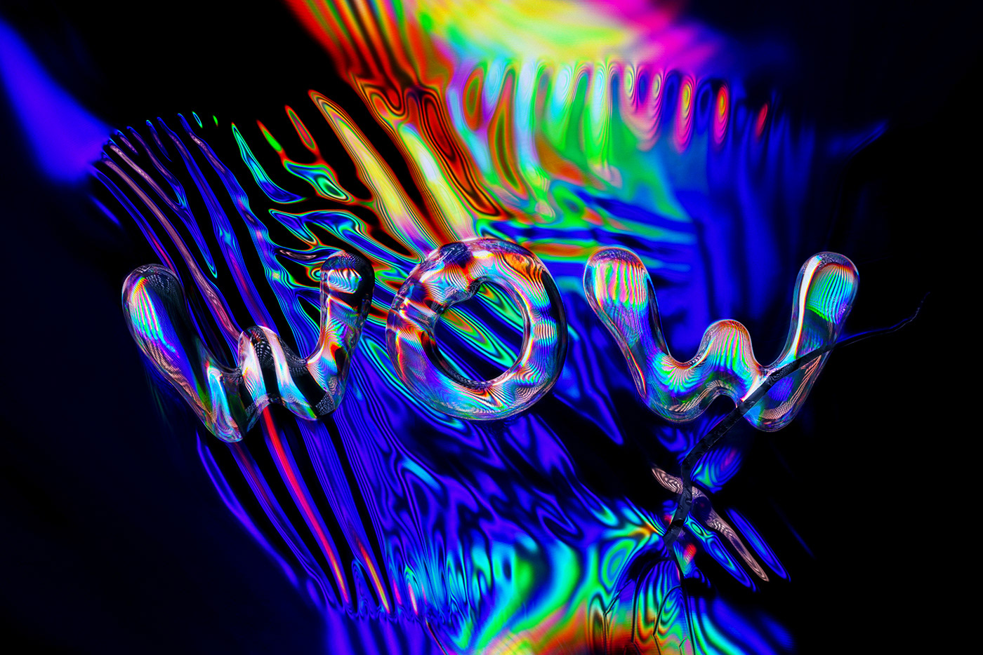
The WOW Word, the Glowing Art of Rus Khasanov Succulent chromatic color, unpredictable natural movement, the contradictory ways of oil and water vying …
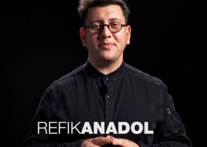
TED talk by Refik Anadol Art Materials for Superpowers Trying to think yourself out of the box? Try thinking your …
William Kentridge Expands I still remember my mother laughing about how wowwed she was the first time she saw the movie …
I can’t find this photographer though I collected her work within the last two days. Ouch! …OK, now I have …
Woodshedded (verb) (continued from last post) Last night I was woodshedded by a friend, in the sense that I was …
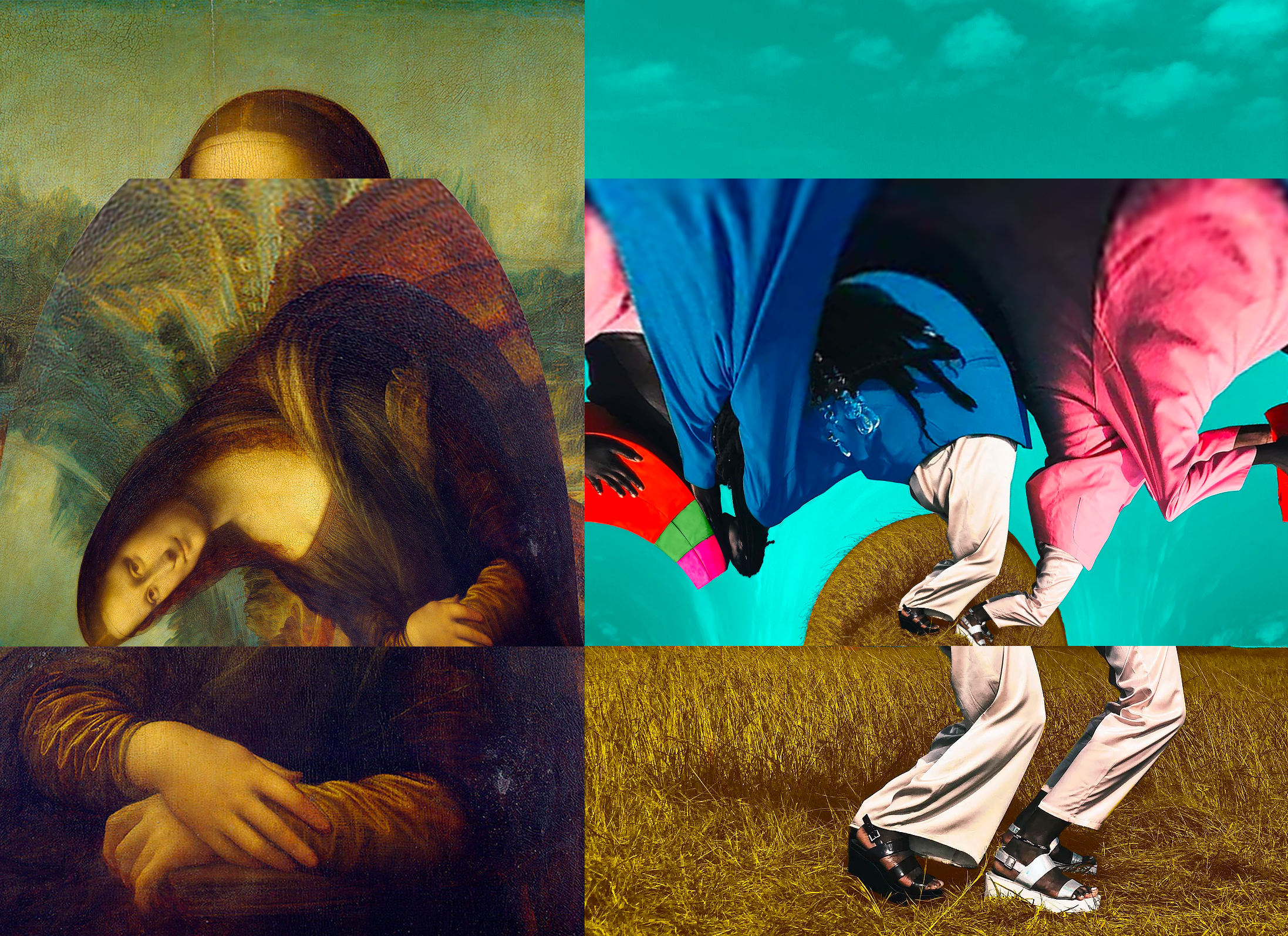
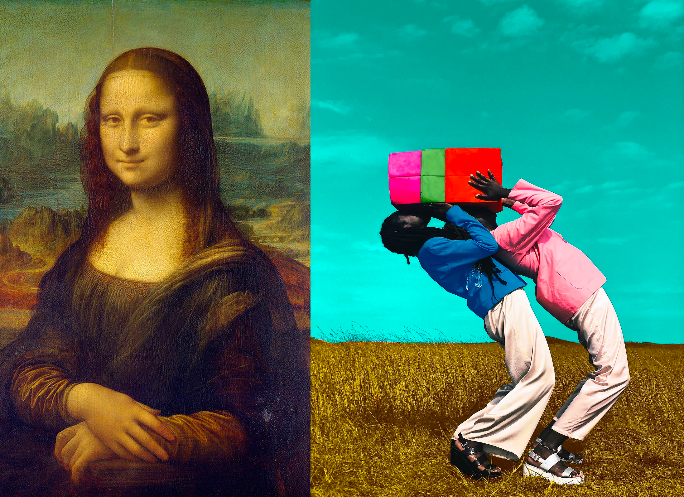
Free Use, Copyright Law (Please also read next post) Testing, testing. Above we have two images. One is by Leonardo …
Addendum (11.01.20.) I’ve received feedback that some think Deborah Roberts is a so-so artist. I emphatically disagree. I also disagree – …
A lens can focus light to form an image, unlike a prism, which refracts light without focusing. Devices that similarly focus or disperse waves …
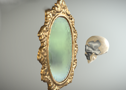
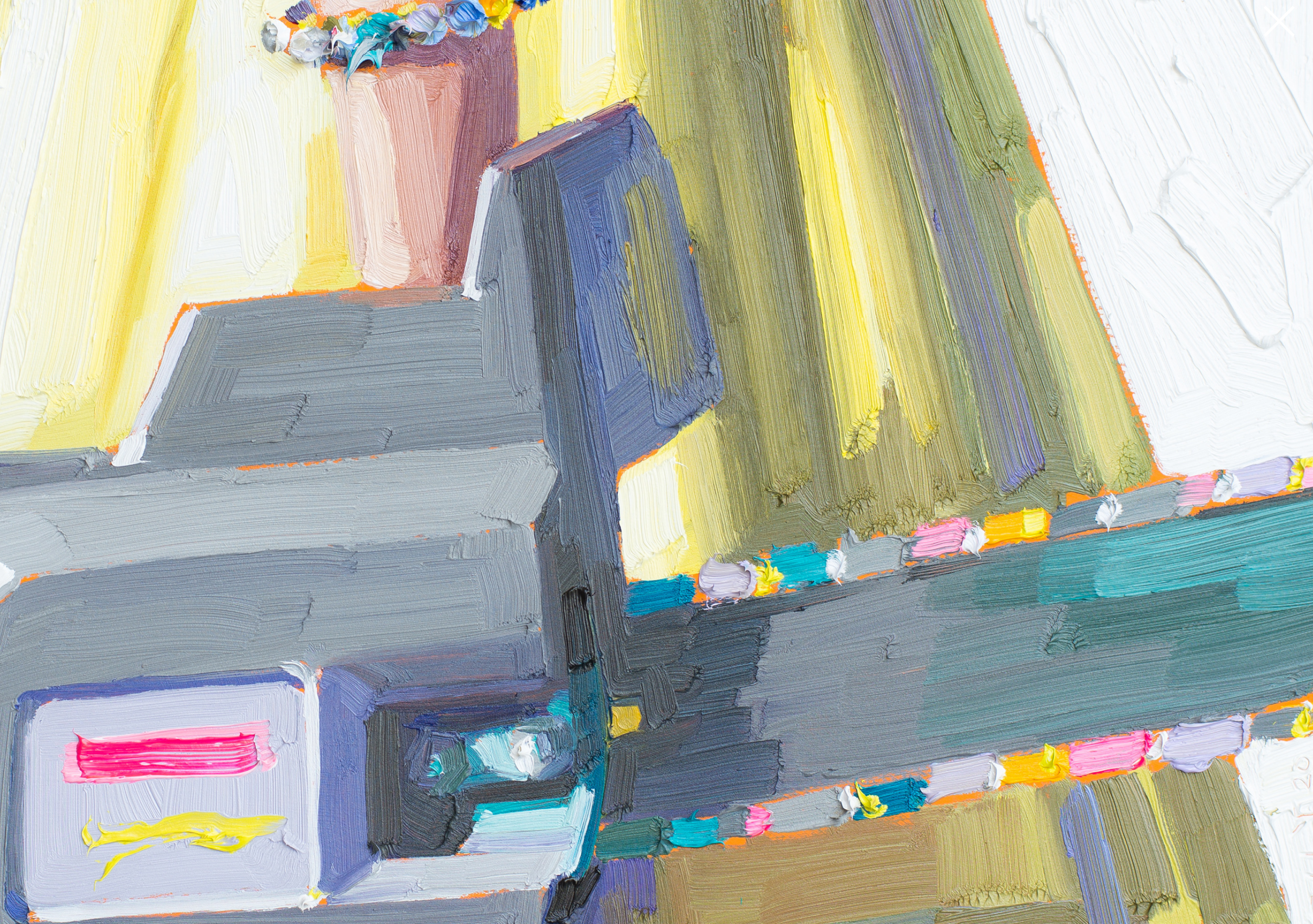
Details of Wholes When an artist mixes this with that, apples with oranges, copper and cork my interest perks up. In …
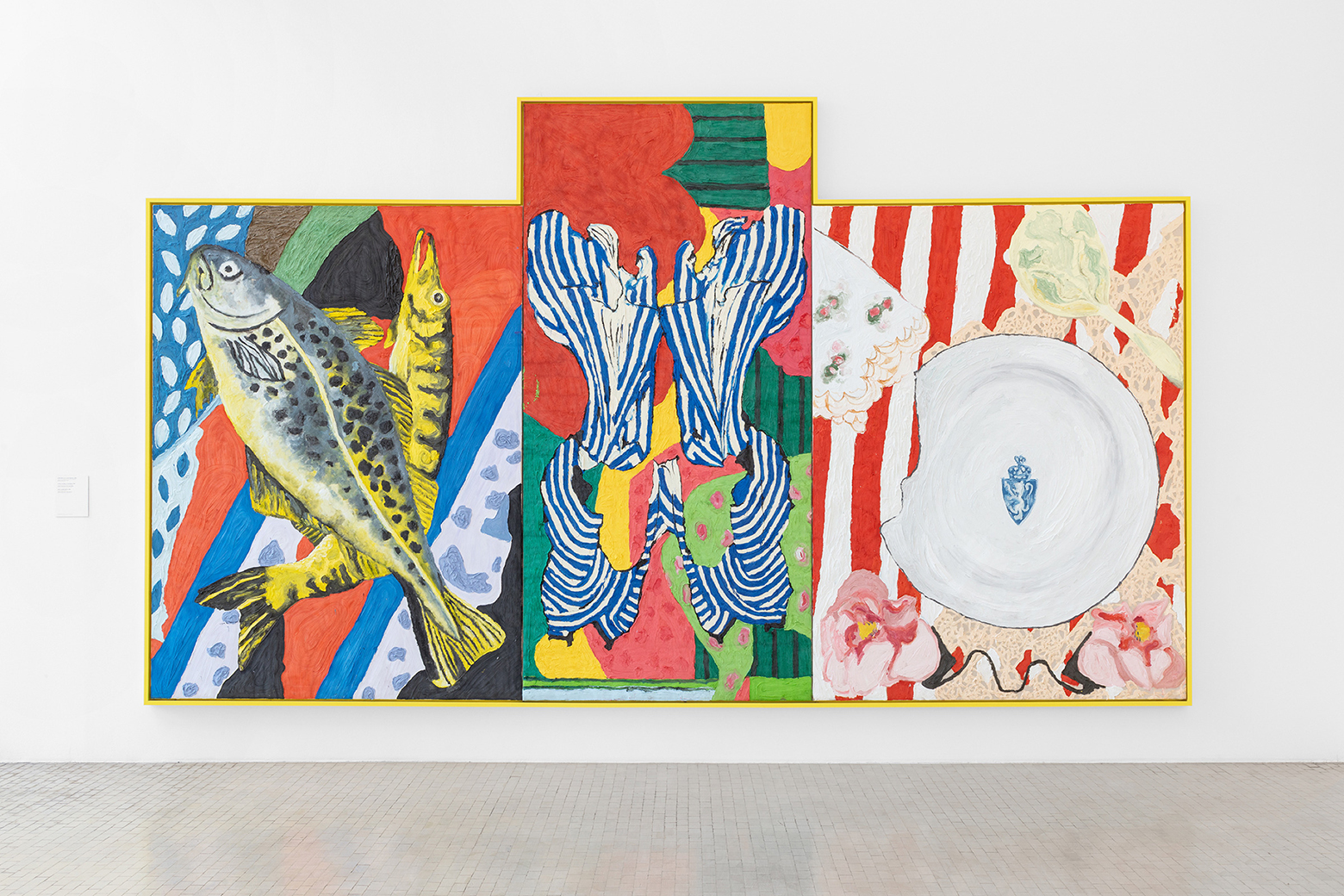
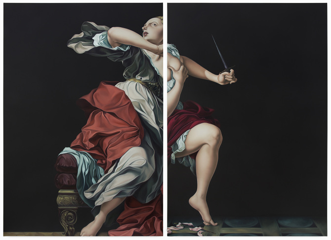
Split-screen: Jesse Mockrin’s Narrative Paintings Jesse Mockrin is a painter who developed a new compositional style and bounded forward in ten-league …