By on July 3rd, 2013

 4 Koons vacs


Look at these four Jeff Koons sculptures.  What do you see?   The more attention you pay the more specific you can be.  Size, color, shape, configuration…  Oddly, the first thing I see is in the diagram below these.

clockwise from top:

  • •   New Shelton Wet/Dry Doubledecker, by Jeff Koons     via Museum of Modern Art
  • •   New Hoover Convertibles, Green, Red, Brown, New Shelton WetDry 10 Gallon Displaced Doubledecker, by Jeff Koons     via allartnews
  • •   New Hoover Deluxe Shampoo Polishers, New Shelton Wet/Dry 5-Gallon Displaced Quadradecker, by Jeff Koons           via exhibitioninquisition
  • •   New Hoover Convertibles, New Shelton Wet/Drys 5-Gallon Doubledecker, by Jeff Koons    via Astrup Fearnley Museet

I see abstract designs and I see the designs as potential patterns.  I’m pattern-hungry, a quirk of the brain.  For example if we simply tile out the two right-hand examples we get these two different patterns.  (Sketches, not to scale.)  Koons’ upper right is our only example where he varies color, hence the extra tones here.  His lower right is the only one with reclining forms.

These artworks are simple to dissect visually and therefore handy in explaining some abstract notions about art.  And they let us see that the abstract patterns can represent big banks of vacuum cleaners, yes.  But they could equally represent toothbrushes or sounds.  They could be plants in a formal garden.  They could be the ratio of chocolate chips to pecans in your favorite recipe.  Math.

What we’re looking at today is what happens in the arts when you map content onto a pattern.

________________________________________________

What if you complexify your elements and increase their number?  Structured Studio Situation by Danish artist Tommy Støckel shows you one delightful possibility.  Paper, styrofoam, balls, what have you.  Configured, repeated and repeated.  Sarah Sze in army boot camp?  But look at how wonderfully the white rectangle in the middle helps to excite the overall design and yet is a pattern variation within the whole.

Støckel is a meticulous visionary.

All four views of Structured Studio Situation by Tommy Støckel at Location One, New York     via Støckel’s website

________________________________________________

We said a pattern could be built of sounds — Ravel’s Bolero is a fine example.  Or here’s a diagram for bell-ringers in a steeple that tells them who rings next.  The very animated GIF below (30 frames )is from the same source.

Bell-ringing chart and animation both from James Bryant, University of Texas at Austin.    via his webpage about campanology.

Patterned sound.  Which brings us to the work of Gabriel Shalom, a German videomusician whose artistry impresses me.   I remember it, I ponder it.  Shalom’s patterning units are short video clips.  Here’s what he makes of them.

Object Oriented — Rafael, by Gabriel Shalom      via his vimeo page


Object Oriented — Giles, by Gabriel Shalom      via his vimeo page

________________________________________________

This blog takes more than a passing interest in notions of patterning.  We’re pattern-making, pattern-seeking animals.  So are orcas, robins, dancing bees.  It’s fundamental, mighty, often transparent — and can be a wonderful lens on the fruits of creativity.


look further

Gabriel Shalom

Tommy Støckel

A near-oops with an Oom-pah-pah

  • I was going to start this post with this line:The syllables oom-pah-pah may conjure up a tuba for you — because what looks like nonsense is actually a pattern we recognize.  Because I was about to attribute it to John Philip Sousa I looked it up.  Good thing.  Wikipedia says:Oom-Pah-Pah” is a lively and somewhat risqué song from Lionel Bart‘s musical Oliver!, sung by Nancy and the crowd at the “Three Cripples” tavern. The word “oom-pah-pah” is seemingly used euphemistically to refer to both intoxication and fornication; however, as the song points out, the word’s meaning is only as dirty as the listener interprets it. 


By on May 15th, 2013

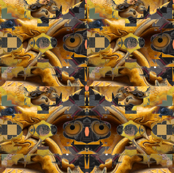
Images from CG Textures

A dragon and two birds, a haphazard choice.  Or say the images attracted me so I used them.  This isn’t science, it’s art.  And every artist grows a way of working as unique as the whorls on their fingers.

I’m driven to combine images — it scratches where I itch. (Monet obviously itched somewhere else.)

I think of my work as clastics.  Here’s what geologists call a clastic rock:

Clastic rock     via Kean University — kean.edu

Clastic can also describe a take-apart anatomical model such as this doozy by Jason Freeny:

Kewpie Door by Jason Freeny      via Moist Productions

Synchronicity break — because I’ve been looking at canvases by Jeff Koons I have to include another Freeny work.  Note that #49 designates the frontal lobes.

Pneumatic Anatomica by Jason Freeny       via Moist Productions

So clastics are made up of pieces.  Glued-together glass, collages, the call-and-reponse of colored lights on aluminum panels.  My brain in pieces does work.

Patterns: pieces in repeat.  Collage: piecework but with different assembly rules.  Digital joinery has yet another set of rules.

Thus yesterday the dragon and two bird images got combined with these two patterns.

patterns by Sloan Nota

To make what I’m now reaching for in art, a richer pattern.  Here’s one repeat unit.

Pattern Unit 051313 37, by Sloan Nota   (copyright 2013)

Here’s what joining repeats into a pattern does.

Pattern 051313 38, by Sloan Nota  (copyright 2013)


It pleases me that what reads as an owl’s face (but isn’t) also feels indented in deeper space.  The luck of not drawing.  Meaning I’m a digital not a plastic artist — which provides me benefits that other artists don’t have.  One side of the balance sheet is well known — digital art lacks certain niceties available to artists using paint or stone.  Let me extol the digital side.

In geology the clastic rocks are the sedimentary ones, where chunks of this and that percolate down through the soil and get cemented in sand, silt, clay.  My percolating chunks are the whole of public domain imagery — no image ‘doesn’t fit’ or bounces out of bounds.   And  I get to play with them and see what hijinks they get up to together — eg: a nice non-owl owl.  I can take a snip of Rembrandt and half a drawing I made when I was six.  Or an Audubon swan, an iPhone snap and a clipart taxi.  Because the digital tool shop is rich I can slice and dice, blend layers, mask with a porcupine silhouette — and/or wrap on a 3d object, distort with displacement maps, and on and on and on.

I can do in an instant what would take a painter days to do.  Yep, it’s a shortcut.  I hear booing from the balcony.  But the ultimate test should ask an image how good it is.  What I do quickly represents decades of experiment and dogged doing.  And I goddam love making digital artwork.

Pixels have power too.

——

look further:

The clastics.com domain is taken by the geologist Chuck D. Howell.  I salute him here.